Showing posts with label technique. Show all posts

Friday, September 11, 2015

Let's Do Some Exploring!

It's been awhile since I've written a post going through my process of creating an illustration and so I thought with this recently completed promotional piece, I'd do just that.


Here is the finished illustration. With the theme for this illustration being "adventure", I drew inspiration from Indiana Jones and Mission Impossible. Whenever you get free reigns to essentially do what you want, I find a good place to start is to stick to subject matters and themes that interest you or things you think would be fun to draw. So for me, Egyptian culture has always interested me, so a big part of this illustration was just me giving myself the opportunity to add all the detailing and decorations to the walls and the treasure box.

So follow me as I go through my process;

 
With the theme and idea firmly in my head, I started out with a simple sketch. Because the theme of this piece is adventure, I wanted to make it easy for myself and designed the composition using diagonals and some forced perspective, these naturally give you a sense of action and movement, which are things I am looking for. So after my initial gestures and established composition, I began to start refining and adding in the details. This is where Google Images will be your best friend. Along with what you find on the internet,


This is just a sample of photos I found on the web. In addition to this, I also took reference photos of myself to help me figure out the pose better. This was especially the case for the foreshortening of the arm reaching for the treasure.    

For the background of my sketch, I basically left it loose and blank, I more or less had a plan in my head to add in the details and etching but I wanted to do that once I move onto the painting phase. Not only did it save me time, it also gave me the freedom to play and have fun with it.


Just by going through the research process, it gave me a good idea of the colors I wanted to use for the illustration. So first stage, like always, is to lay in the general colors. I did this in a multiply layer so my initial sketch remains intact. After that I started my first pass on the main figure and the foreground elements. This layer is on top of my sketch layer and is set to normal, that way my marks will start covering up my drawing. BUT not to fear, I always keep a separate copy of my sketch at the very top of my layer stack, that way I can switch it on and off if I need to refer to something.


After that, I made a similar pass with the background. As I rendered out the stones, I decided to go with the dark shadowy patch at the top right cause it provided a natural framing element to the composition. In addition, it meant I wouldn't have to render that area of the stone...so win win!


With that, my attention went back to the main figure. In addition to rendering him out and adding all the details to his clothing and harness, I made sure I tinted him so he would blend better with the color scheme.


With some minor adjustments to my adventurer's arm, I turned my focus to the treasure box. My plan all along was to have a glow emanate from the top, but while I was adding the details, I decided it needed a "lid" of some kind to make it more obvious that it's an opened box. Once that was done, I started adding the decorative elements to the stones.


I guess I was having so much fun that I added detailing on all the walls! After that I worked out what was going on the ceiling. I added the two kids and tried to design some "believable" rope-lowering apparatus. With that, I was almost done...


All that was left was to add in some rim light coming from the moon. This helped separate the figure from the background. Lastly, I made some final color adjustments and I called this one a wrap!


Monday, February 24, 2014

Make it Work

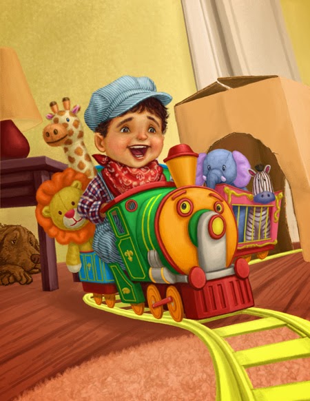
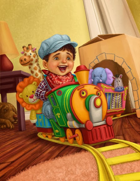
I recently finished this new promo piece. This illustration will be included in the next promotional catalog put out by MBArtists.


The illustration was inspired by my son, who happens to be obsessed with trains at the moment. I wanted to share my process with everyone, so please follow along as I go from the initial sketch to the final illustration;

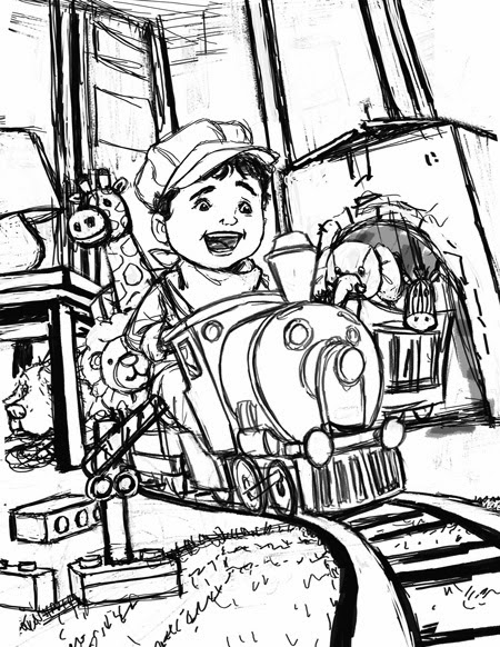
With any illustration, I started with the sketch.  This was done in Photoshop. At this point, I was still not completely satisfied with the background or the foreground elements. Typically, if this was for a client, I would make sure to resolve everything before moving on...however, since I was essentially doing this for my own indulgence, I decided to plow ahead and see where things would take me. One of the luxuries to being your own art director is that you get to explore and react to a piece as you are developing it. 

But before I moved onto colors, I duplicated my sketch layer. One layer, I left at the very top of my layer stack, this will be left invisible and set to multiply. This layer would only be turned on if I needed to refer to my sketch later on as I rendered. My second layer was put at the very bottom of my stack. 

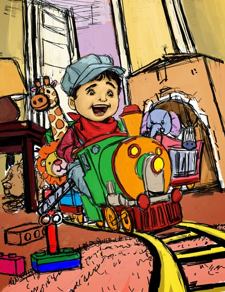
The next step was to introduce colors. I laid down my basic local colors on a separate multiply layer. This layer is sandwiched between my two previous sketch layers. This way I was able to apply colors fast without having to worry about losing any of my line work. 
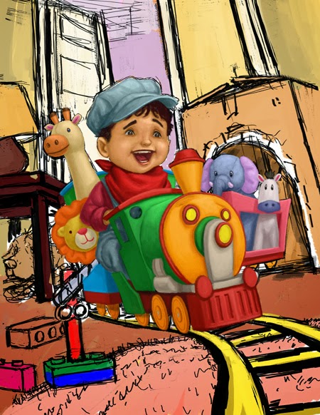
From there, I created new layers for each object(i.e. boy, train, dolls, etc.), and I rendered out the main elements of the illustration. At this point, I only focused on the light and the form, still remaining in my local colors. I established my light source, which is coming from your upper-right hand corner. Since these layers were left as normal layers, I am slowly covering my line work underneath.
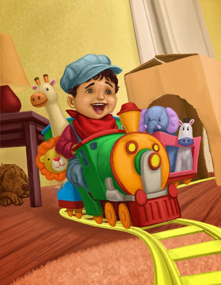
I repeated the same process for the rest of the illustration, this included the background. As I began to add my door, I played around with the placement of it. And as soon as I placed it to the far right, I really liked what it did for the composition. Not only did it essentially open up the room and create more sense of depth, it naturally flowed with the way the tracks receded into space. Another change I decided to make was the direction my dog was facing in the corner. By flipping him over, I thought he now flowed more naturally with the direction of the action.   
At this point I went back to my main elements and gave each a second pass. With my main forms and shapes already established, I am now free to focus on the details.

Here's a detailed before-and-after of the boy. With the second pass of the face, I used a layer set to soft light to create the richness and the blush in the cheeks and nose. The soft light layer allowed me to glaze on color without losing any of the brush work underneath. And I'm always amazed at how a couple simple touches of color can bring a face to life.

With the patterns and designs on the fabrics, I used a blend of overlay, soft light, and color layers. This was made easier by creating clipping masks for the separate patterns. Below is a screen shot;


(The clipping mask are represented by the arrows pointing down to it's "parent" layer, this is why some refer to this as "parenting")

By parenting my layers, it allowed me to freely make strokes without worrying about the marks breaking beyond the silhouette of the parent layer. I played with the opacity and the blend of each layer until I came up with a combination I liked.
With the details of the main elements done, I turned my attention to the background. The detailing was  accomplished much in the same way. 
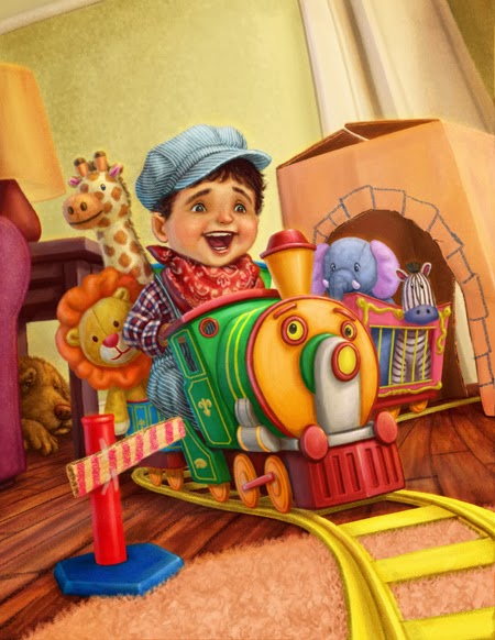
With the main parts of the illustration addressed, I focused my attention to the foreground. At this point of the process, I had hoped to have a clearer idea of what to do, but that wasn't the case. So a lot of this was done through trial and error. I played with the idea of adding several different toys, from legos, to plastic trees, marbles and even a pillow. Finally I ended up with this makeshift guard rail. I thought compositionally, it helped to further direct a viewers eyes through the illustration.

In addition, I also, included a hint of a couch on the left, and the ceiling trim at the upper-left corner. These served as part framing element and further established that this is a living room.
All there was left to do was the finishing touches. I added the brightest highlights to punch things up. These were mainly reserved for the specular highlights on the train. I also added a cooler light source coming from the left. This gave the objects that extra bit of volume, as well, it helped unify everything. 

Lastly, I made some minor adjustments here and there and I officially called it one completed.   
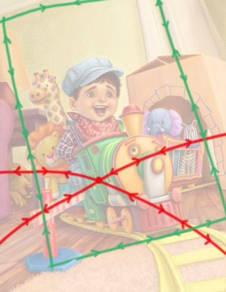
Highlighted are the directions a viewer's eyes travel through the composition. In both cases, I have created movement drawing the eye back to the main focal point, which are the boy and the train.


Overall, I am really satisfied about how my illustration turned out. And I'm especially happy with the composition. Although, I didn't have everything planned right from the get-go, I continued to search for solutions as I painted. I have often praised this medium for the freedom it gives me when it came to editing. I can play and test things without any worry, and with my illustration, I really took advantage of.this. The lesson I learned here is to remain open to experiment, and not to just settle on the first thing that comes. And if this means deviating from the sketch, go for it. In short...just Make it Work!


Saturday, September 28, 2013

Is it That Time of the Year Again?

Even though we are still months away from the official start of the holiday season, I actually took it upon myself to be proactive this year. And NO, I'm not talking about pre-shopping and scoping out all the big deals and sales, or figuring out what presents to get family and friends, oh no, but more importantly, I just finished my last promo piece of the year early!

And that is a far cry from my norm, which is to procrastinate til the eleventh hour and then in a state of panic, try to whip up something that looks halfway decent. Anyway enough talk, here's the art.


Here's my initial sketch. Not much was changed from the final except for the addition of the ornament on the reindeer's nose. I thought it was a nice touch. Rudolph would be so proud.


This is the inspiration behind my illustration. Really early on, I had a pretty good idea of how I wanted to approach my color palette. I came across this illustration by Scott Gustafson (one of my favorite illustrators) and was enamored by the contrast in the warm light against the cooler moonlight. He was able to create a night scene with such warmth and richness to it, I really wanted to recreate some of that same feel in my own illustration. 


Monday, January 21, 2013

Fairy Tale Promotional Illustration


I'm back with the finished illustration! I really had fun working on this piece! Below I'll quickly share my process:


As usual, I wanted to quickly establish the basic color scheme of the illustration. Because I hadn't settled on a color or look of the jellyfish at this point, I decided to ignore them for now and concentrate on the elements I had a better grasp on. I was hoping that once I had some sort of color down, it would give me a better idea for them later on.

Here I made my first big pass on my mermaid character. Once I had her in pretty good shape, I went back and continued to pull out the rocks in the background as well as the coral in the foreground.

Next I added the sack for the dolphin. After that, I made another pass to the coral and cleaned it up further. The purpose was not only to tighten up the area but I also wanted to create more illusion of depth.


At this stage, I finally felt comfortable enough to add the jellyfish...WELL ACTUALLY, I simply stalled as long I could and I simply ran out of other things to work on.

Here is the final piece again. With all the main elements worked out, all that was left was to tie everything together. I gave the illustration a blueish tint, since we are underwater afterall! Along with that, I focused my attention to the composition and added some final value adjustments. And with a couple touch ups as well as some finishing touches to amp up some of the fantasy and the drama, this one was a wrap!


Friday, April 20, 2012

In Living Color

...And here's how it turned out.


Overall, I'm pretty happy with how everything came together. There is a lot of fun stuff going on, but for me, I especially enjoyed rendering the robo-dino. It's not too often I get to embrace my inner geek, so whenever the opportunity presents itself, I try to make the most of it.

And here's the process I took to get there...


First, I always start with the most general, I blocked in all my major shapes with color. Here I am simply establishing the basic color scheme of the illustration. In the past, when I was still working with acrylics, this step would be a lot more difficult. I'd always have to worry about losing my drawing underneath layers of paint or simply having it washed away from the water in my brush. However, with Photoshop, this problem is no longer an issue. By keeping the colors in a separate multiply layer(Photoshop speak btw.), the lines would not be effected whatsoever, which gave me the freedom to throw color around with abandon. This freed me up to play and explore different palettes without worrying about getting my colors muddy since I could always edit if needed. Definitely a true plus in working digitally. Once I settled on something I liked, I could move onto the next phase.


This meant a quick pass on the main characters and elements of the illustration. I established a bit more of the form and detail to each of the characters, but my main priority was the boy's face. With any illustration I work on, the face is the most important thing, and a major hurdle, so I try to nail those down as quickly as I can. In many ways, this can be the most crucial stage in my working process, cause it can very well set the table on how the rest of the illustration will go. Usually, if I can't get a face to look right,  it meant I'd be fighting the piece the whole time, cause I'd have to go back over and over again trying to rework it. Luckily, in this case, the boy's face didn't give me too much trouble, and I was able to get him looking pretty decent at this stage. And having cleared this major obstacle, I was able to relax a bit moving forward.


Next I gave the background and ground a pass. At this point, my brain is on auto-pilot. There's not much thinking involved here, I simply wanted to fill the back area with "junk". This part took a bit of time, and was a bit tedious, but I felt it was necessary. Obviously, the quickest and easiest solution would have been to put in a blank wall there, but it also wouldn't have added anything to the illustration either. All the stuff back there helped to establish more of the story, mood and interest to the piece, so it was time well spent.


After that, I went back to the main elements in the foreground and gave them a second pass. I focused on the smaller details this time. I cleaned up all the edges and gave it a more polished look. At this point, all my major elements were in place and I had pretty much worked everything out. This is probably my favorite part working on an illustration, once I can visualize the final illustration, I can just zone out and make things look pretty. 


And finally, here's the finished illustration again. After taking a step back, I realized I needed to rework the boy's face and expression. Along with that. I added a couple finishing touches. The lighting effects here and there, as well the the random materials on the floor. All these helped to tie everything together. 


Sunday, April 15, 2012

Composition, composition, composition!

Next comes the fun part, and that is designing the actual illustration. For me, it starts with jotting down some quick thumbnails...
For me, there's no real set number of thumbnails I must do before moving on to the final sketch, I just keep at it until something jumps out at me, but on average, I tend to do about 5-6. With these, all I'm doing is working out possible compositions. These should be quick and loose, and I'm sure they look like nothing more than mere scribbles, but that's kind of the point. The last thing I want to get hung up on at this phase are the details. The main focus is to explore different perspectives and points of views until I get something I feel will make for an interesting composition. Once I make my choice, I can then start on my final sketch. .


This is where I start adding in all the details, and make things look "pretty". Next comes the color...


Tuesday, March 27, 2012

The supremely editable medium.

It goes without saying that one of the big pluses of working digitally is the ability to make changes cleanly and quickly. Below is a great example of this in action; I created this illustration and showed it to my agent, and she suggested that I try and change things up and work with a new palette. And so, with just a couple simple hue/saturation layers, I was able to rework the colors and change the overall mood of the piece. The best part is that it only took about 10 minutes.