

The illustration was inspired by my son, who happens to be obsessed with trains at the moment. I wanted to share my process with everyone, so please follow along as I go from the initial sketch to the final illustration;
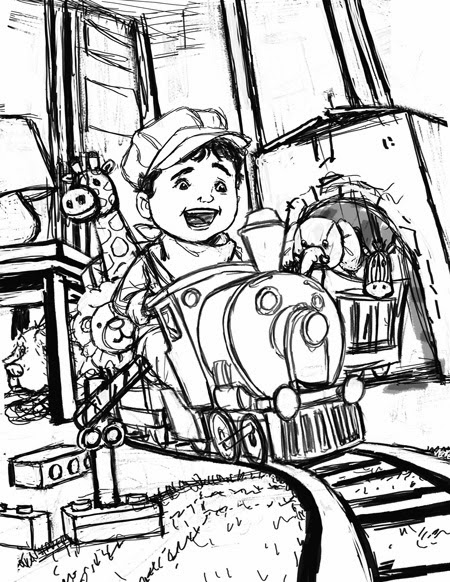 |
| With any illustration, I started with the sketch. This was done in Photoshop. At this point, I was still not completely satisfied with the background or the foreground elements. Typically, if this was for a client, I would make sure to resolve everything before moving on...however, since I was essentially doing this for my own indulgence, I decided to plow ahead and see where things would take me. One of the luxuries to being your own art director is that you get to explore and react to a piece as you are developing it. But before I moved onto colors, I duplicated my sketch layer. One layer, I left at the very top of my layer stack, this will be left invisible and set to multiply. This layer would only be turned on if I needed to refer to my sketch later on as I rendered. My second layer was put at the very bottom of my stack. |
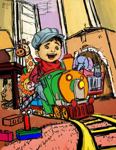 |
| The next step was to introduce colors. I laid down my basic local colors on a separate multiply layer. This layer is sandwiched between my two previous sketch layers. This way I was able to apply colors fast without having to worry about losing any of my line work. |
 |
| From there, I created new layers for each object(i.e. boy, train, dolls, etc.), and I rendered out the main elements of the illustration. At this point, I only focused on the light and the form, still remaining in my local colors. I established my light source, which is coming from your upper-right hand corner. Since these layers were left as normal layers, I am slowly covering my line work underneath. |
 |
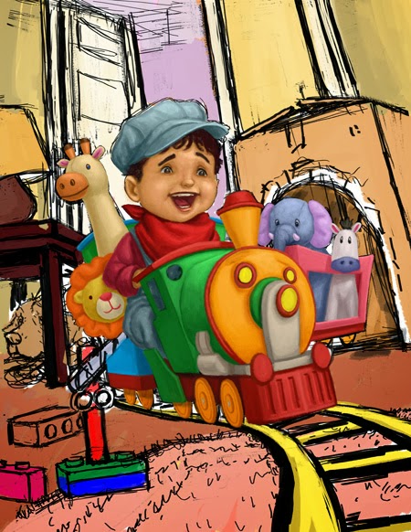
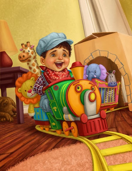
| I repeated the same process for the rest of the illustration, this included the background. As I began to add my door, I played around with the placement of it. And as soon as I placed it to the far right, I really liked what it did for the composition. Not only did it essentially open up the room and create more sense of depth, it naturally flowed with the way the tracks receded into space. Another change I decided to make was the direction my dog was facing in the corner. By flipping him over, I thought he now flowed more naturally with the direction of the action. |
 |
At this point I went back to my main elements and gave each a second pass. With my main forms and shapes already established, I am now free to focus on the details. Here's a detailed before-and-after of the boy. With the second pass of the face, I used a layer set to soft light to create the richness and the blush in the cheeks and nose. The soft light layer allowed me to glaze on color without losing any of the brush work underneath. And I'm always amazed at how a couple simple touches of color can bring a face to life. With the patterns and designs on the fabrics, I used a blend of overlay, soft light, and color layers. This was made easier by creating clipping masks for the separate patterns. Below is a screen shot;  (The clipping mask are represented by the arrows pointing down to it's "parent" layer, this is why some refer to this as "parenting") By parenting my layers, it allowed me to freely make strokes without worrying about the marks breaking beyond the silhouette of the parent layer. I played with the opacity and the blend of each layer until I came up with a combination I liked. |
 |
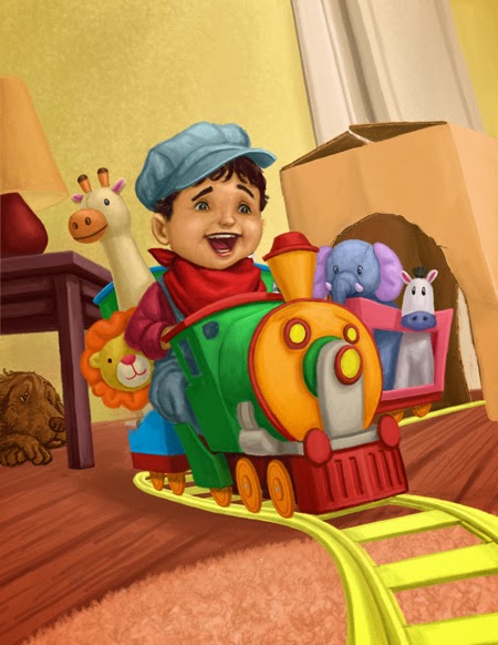
| With the details of the main elements done, I turned my attention to the background. The detailing was accomplished much in the same way. |
 |
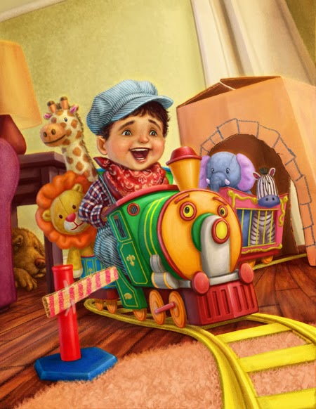
| With the main parts of the illustration addressed, I focused my attention to the foreground. At this point of the process, I had hoped to have a clearer idea of what to do, but that wasn't the case. So a lot of this was done through trial and error. I played with the idea of adding several different toys, from legos, to plastic trees, marbles and even a pillow. Finally I ended up with this makeshift guard rail. I thought compositionally, it helped to further direct a viewers eyes through the illustration. In addition, I also, included a hint of a couch on the left, and the ceiling trim at the upper-left corner. These served as part framing element and further established that this is a living room. |
 |
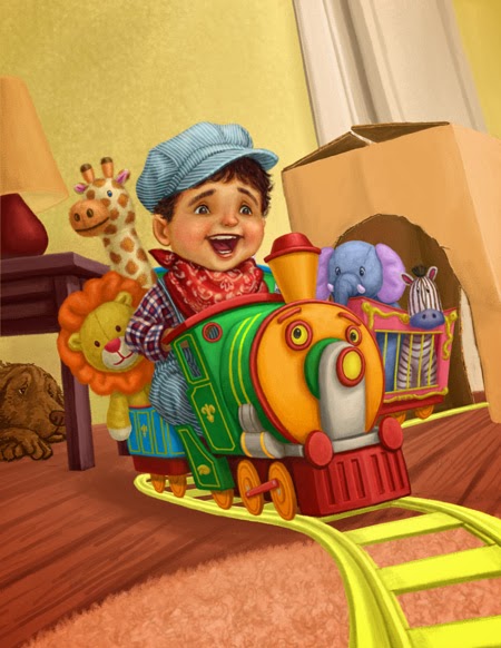
| All there was left to do was the finishing touches. I added the brightest highlights to punch things up. These were mainly reserved for the specular highlights on the train. I also added a cooler light source coming from the left. This gave the objects that extra bit of volume, as well, it helped unify everything. Lastly, I made some minor adjustments here and there and I officially called it one completed. |
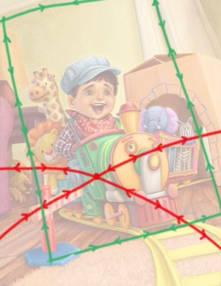 |
| Highlighted are the directions a viewer's eyes travel through the composition. In both cases, I have created movement drawing the eye back to the main focal point, which are the boy and the train. |
Overall, I am really satisfied about how my illustration turned out. And I'm especially happy with the composition. Although, I didn't have everything planned right from the get-go, I continued to search for solutions as I painted. I have often praised this medium for the freedom it gives me when it came to editing. I can play and test things without any worry, and with my illustration, I really took advantage of.this. The lesson I learned here is to remain open to experiment, and not to just settle on the first thing that comes. And if this means deviating from the sketch, go for it. In short...just Make it Work!